
I didn’t hear the term “pixel art” until I was an adult. But as a kid, I could tell you that “Big” Mario looks better in Super Mario Bros. 2 than in Super Mario Bros. 1. And it wasn’t until the Pandemic that I started actually doing pixel art myself.
Saultoons, a game designer, artist, and YouTube/Twitch streamer, runs a pixel art challenge every September called “Septembit.” Each year there is a new theme, and with each theme comes 30 prompts (one per day of September). The theme tends to involve a specific set of colors, or a specific number of colors, along with a general subject (like “animals”). Each prompt is usually a single word, along with the required dimensions of the image you are supposed to draw for that word.
Septembit 2020
I started with 2020’s Septembit challenge, a few weeks before the 2021 challenge was about to start.
Theme:
Creatures
Colors:
2 colors: black and white (“1-bit” means there are only two options: 0 and 1, off and on.)
Dimensions:
16×16 pixels (16 high and 16 wide, for prompts 1-27) and 32×32 (for prompts 28-30)
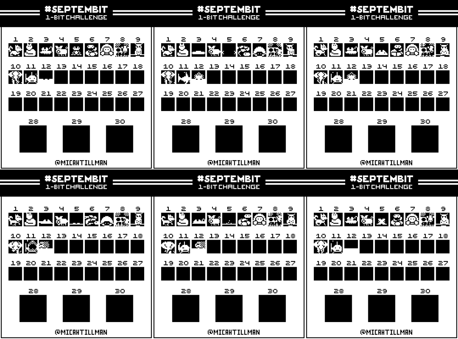
As you can see, I didn’t have time to finish them all before Septembit 2021 began. Alas! One day I should go back and finish the set.
Prompts:
Row 1: Dog, Cat, Mouse, Pig, Frog, Snake, Turtle, Cow, Owl
Row 2: Elephant, Shark, Hedgehog, Jellyfish, Lion, Rabbit, Eagle, Whale, Giraffe
Row 3: Starfish, Monkey, Octopus, Bat, Kangaroo, Butterfly, Chicken, Dolphin, Crocodile
Row 4: Phoenix, Dragon, Unicorn
Comments:
You can’t do a lot with two colors and only 16×16 pixels to work with, but I realized you actually had a lot more than 16×16 pixels if you animated each image. I tried to apply some of the animation principles I was learning from watching YouTube videos about videogame animation.
Septembit 2021
Theme:
Fantasy Adventure
Colors:
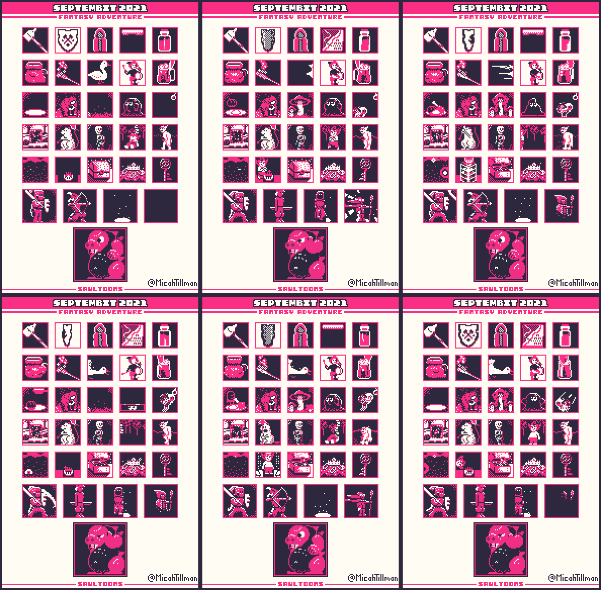
3 colors: black, white, and a kind of reddish magenta something
Dimensions:
24×24 pixels (for prompts 1-25), 32×32 (for prompts 26-29), and 48×48 (for prompt 30)
Prompts:
Row 1: Weapon, Shield, Clothing, Map, Potion
Row 2: Back, Torch, Pet, Bard, Tankard
Row 3: Food, NPC (non-playable character), Mushroom, Slime, Fairy
Row 4: Portal, Rat, Skeleton, Goblin, Orc,
Row 5: Evil Eye, Trap, Chest, Treasure, Boss Key
Row 6: Warrior, Hunter, Rogue, Mage
Row 7: Boss
Comments:
These are all the sorts of things you would see in a video game inspired by Dungeons & Dragons or Lord of the Rings. It was fun to have a third color to work with, and having 8 more pixels in both height and width for most of these was nice too. I particularly enjoyed being able to decide how to interpret most of the prompts.
I think I might be happiest with “Potion,” from this set. I wanted to get the glass to look shiny and the liquid to look sloshy, and I think I succeeded.
I love the angry attack goose for “Pet,” where I tried to make it look like the camera was struggling to catch up. And I am particularly proud of the animation for “Bard.” I think the bard’s pipe hand’s “fingering” reads surprisingly well, and I did okay with practicing “smears” with the mallet (or whatever they’re called) and squash-and-stretch with the drum.
I enjoyed doing something very silly for “Food,” where I was practicing more squash-and-stretch (and I supposed “secondary motion” too?). I got some “camera shake” in on the Rat’s Gandalf-style “You Shall Not Pass!” staff slam.
I’m retroactively pleased with creating a sort of “character” with the “Goblin” prompt, that I could then use in the “Orc” and “Trap” images. I also had fun with doing different “walk cycles” for the Goblin and Orc.
On the things I’m less happy with, I went with a hammer for “Weapon,” but I think I ended up with something that looks like a moonshine jug spinning on the end of a stick. And althought I like the general animation for “Clothing” (for which I went with a free-standing cloak), the internal shading should have been checker-boarded black and red, not black and white.
I like the “hit stop” on the “Warrior” (where the action seems to briefly pause to emphasize the impact), along with the secondary motion that ripples through his body from his helmet down. But I’m less happy with his posing and general design.
In fact, I think the only character I’m basically happy with in the next-to-last row is “Mage,” but his animation is basically another take on what I did with the “Rat.”
For “Boss,” I went with a dragon inspired by Bowser, from Super Mario Bros., and Trogdor from Homestar Runner.
Septembit 2022
Theme:
Pixel Farm
Colors:
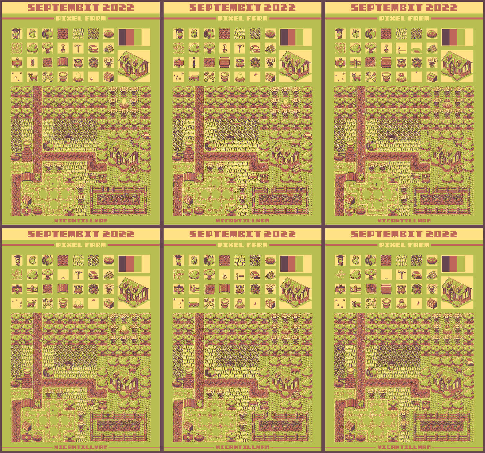
4 colors (yellowish white, yellowish green, light brown, and dark brown)
Dimensions:
24×24 pixels (for prompts 1-28), 72×72 (for prompt 29), and 310×286 (for prompt 30)
Prompts:
Row 1: Farmer, Pet, Tractor, Dirt, Grass, Long Grass, Rock
Row 2: Water/Pond, Bush, Tree, Shovel, Pickaxe, Vehicle, Wood Pile
Row 3: Sign, Fence, Path, Bridge, Seeds, Vegetable Patch, Flower
Row 4: Bugs, Animal, Fruit, Milk, Egg, Fish, Food Stall
Side Image: Farm House
Lower Image: Farm
Comments:
I don’t find farming games interesting and I found the colors kind of off-putting for this Septembit. But, in some sense, those two facts just made the challenge more interesting. And I’m pretty proud of how the whole thing turned out.
It was cool to be challenged to put all the individual images together to form the final image. I love how much activity and motion I was able to get into the image. Having to think about how to draw bugs and fish in a way that would work at the “zoomed out” level of the final image was fun.
I don’t know why the farmer isn’t spinning in place in the final image, though. I mean, it’s kind of a fun effect, him just standing stock still in the middle of a farm where everything else is moving. But I drew him from multiple angles for his individual picture.
Septembit 2023
Theme:
Old School (i.e., classic tattoo subjects)
Colors:
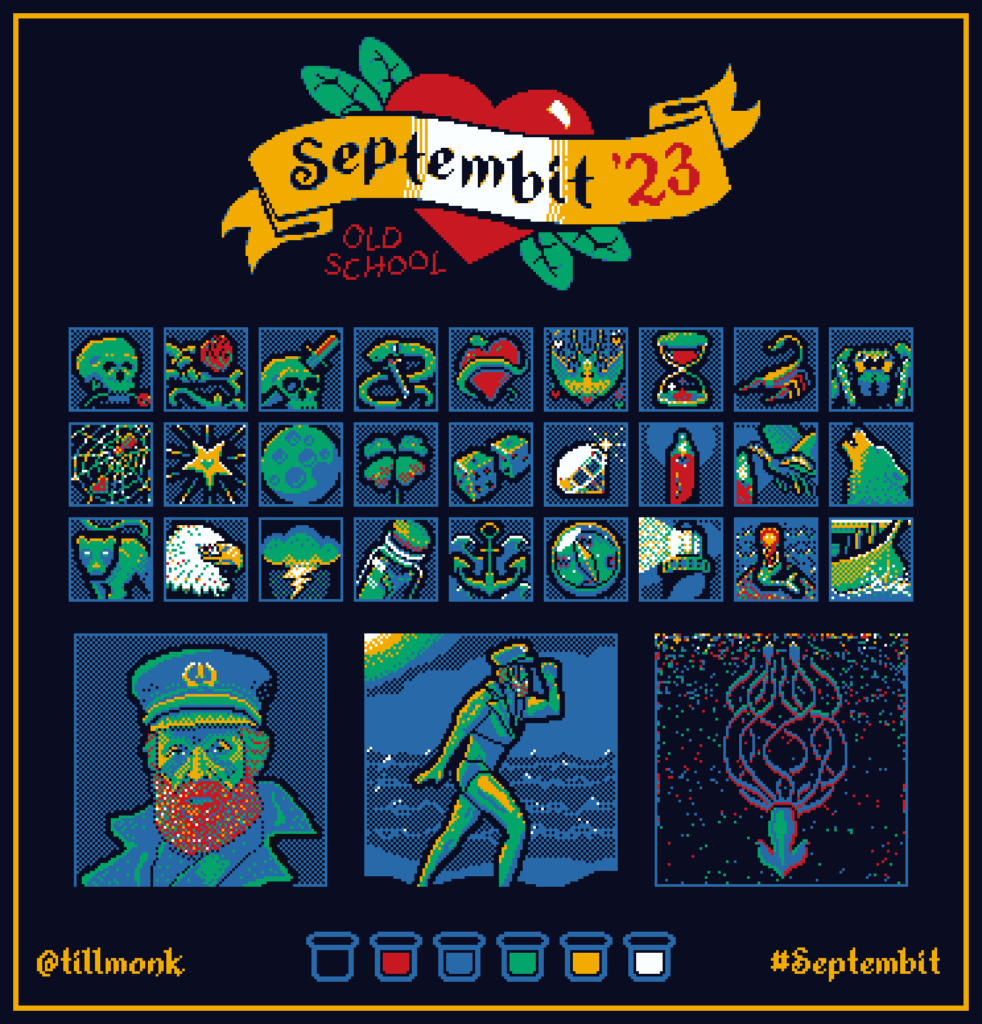
6 colors (black, white, red, blue, green, yellow)
Dimensions:
32×32 pixels (for prompts 1-27) and 96×96 (for prompts 28-30)
Prompts:
Row 1: Skull, Rose, Dagger, Snake, Heart, Swallow, Hourglass, Scorpion
Row 2: Spider, Web, Star, Moon, Lucky, Dice, Diamond, Candle, Moth, Wolf
Row 3: Panther, Eagle, Lightning Cloud, Message in a Bottle, Anchor, Compass, Lighthouse, Mermaid, Ship,
Row 4: Portrait, Pin-Up, Custom
Comments:
Having six colors to work was amazing, and I’m very pleased with how most of these turned out. I enjoyed being able to get things from one image to show up in others (skulls in the 1st and 3rd; daggers in the 3rd and 4th; snakes in the 4th and 5th, hearts in the 5th, 6th, and 10th; candles in the whatever those two are — the ones with the candle and the moth).
I did Willem Dafoe, as his character in The Lighthouse, for “Portrait” and “Pin-up,” since “Lighthouse” was one of the previous prompts. I must have traced screenshots of him for “Portrait,” and maybe for “Pin-up” too (both are definitely meant to be pixel-ized versions of two particular screenshots from the movie), although I also took liberties.
No animation this time. Maybe I didn’t have time. Or maybe I was thinking tattoos don’t move.
Oh, and I also added an outline to each of the images (remaining within the required dimensions), then had fun having some of the images appear to “break” the outlines. Looks like I did something similar with Septembit 2024.
Septembit 2024
Theme:
Monster Maker
Colors:
4 colors (dark blue, light green, pink, brown)
Dimensions:
32×32 pixels (for prompts 1-27) and 96×96 (for prompts 28-30)
Prompts:
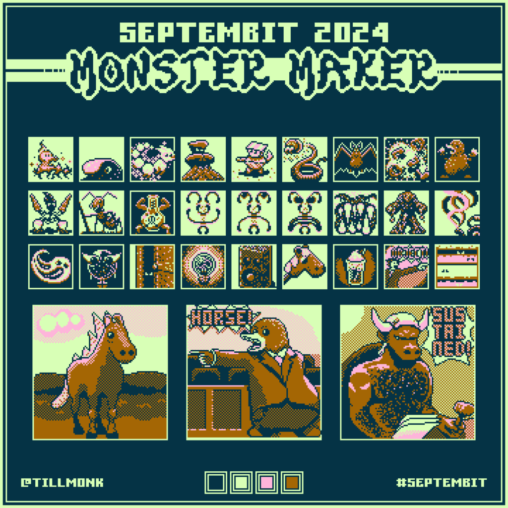
Row 1: Fire, Water, Air, Earth, Metal, Electric, Flying, Fighting, Underground
Row 2: Plant, Bug, Poison, Happy, Sad, Rage, Ice, Lava, Gas
Row 3: Ghost, Psychic, Dark, Light, Sound, Hobby, Food, Object, Abstract
Row 4: Evolve, Combine, Mythical
Comments:
The theme for 2024 was inspired by Pokemon. Every Pokemon belongs to one or more “types,” and many of the prompts for this year were those type names. So, effectively we were being asked to create 30 new Pokemon.
I love how just about all these guys turned out. Pokemon can be a wide range of things from basically-normal-animals to sentient teapots and keychains. So, it left us with a lot of freedom to invent silly characters.
For “Object,” I drew a small version of Phoenix Wright (from the Phoenix Wright games), yelling “Object!” while pointing at the “Abstract” image. In the usual online meme, Phoenix Wright is in that pose and is yelling, “Objection!” (He’s a lawyer, you see.)
For Abstract, I tried to do a sentient Rothko painting (which would be an object). For “Evolve,” we were supposed to draw the Pokemon-style “evolution” of one of the previous pictures, so I showed the “evolved” form of the “Hobby” horse.
For Combine, we were supposed to combine two “monsters” into one, so I combined the “Underground” mole with the “Object” objection. And for “Mythical,” I have a minotaur as a judge, “sustaining,” the mole’s objection that the witness is, in fact, a horse.
Septembit 2025
Theme:
Mini City
Colors:
2 colors (we were allowed to choose, but the idea was to do something like the blueprints for a construction project. I slightly altered the dark blue and light blue that Saultoons used for the template).
Dimensions:
16×16 pixels, 32×32, 96×32, 32×96, 62×62, and 256×256
Prompts:
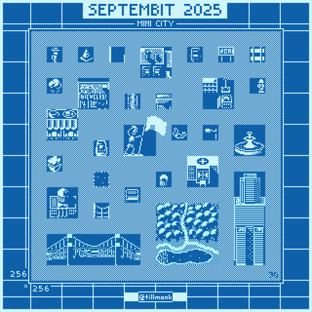
Row 1: Character, Traffic Cone, Road, Factory, Car, Sign, Railroad
Row 2: Tree, Shop, Path, Food Stall, Construction, Fire Hydrant
Row 3: Restaurant, Cash Machine, Statue, Animal, Street Light, Fountain
Row 4: Plant (top), Building (under Plant), Water (top), Fence (under Water), Bench, Bin, Hospital
Row 5: Bridge, Park, Skyscraper
Row 6: Mini City
Comments:
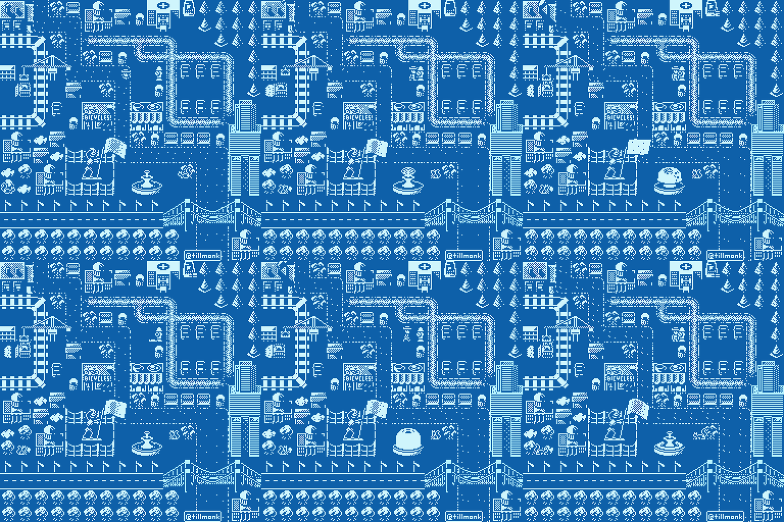
I didn’t do this one right. I’m pretty sure Saul intended us to fill in the empty areas around our smaller images (perhaps using copies of the other smaller images) to create the entire city, which is a very creative twist on the “now put it all together” sorts of larger images he ended previous Septembits with. But I, for some reason, didn’t get that, or didn’t want to do that. So, I created my Mini City in the same way we did the “Pixel Farm,” by placing copies of the individual images together in whatever order we wanted to to create the final image.
As a result, perhaps, of my not following the directions, I didn’t enjoy this one as much as the others. But it was interesting to be allowed to pick my own two colors, and it was interesting to return to the 2-color restriction with which we started back in 2020.
I think I’m most pleased with the skeleton businessman getting blasted by the fire hydrant, the fountains (inspired by fountains I saw as a youth at Longwood Gardens in Kennett Square, PA), and the construction site.
Inspired by what other participants had done in past Septembits, I was also deliberately trying to practice using shadows to imply things, rather than trying to draw all the shapes and textures directly.
Septembit 2026
Theme:
Landscapes
Colors:
4 colors (we got to choose which four, but Saul suggested a white and black with two shades of grey between)
Dimensions:
64×64 for all prompts
Prompts:
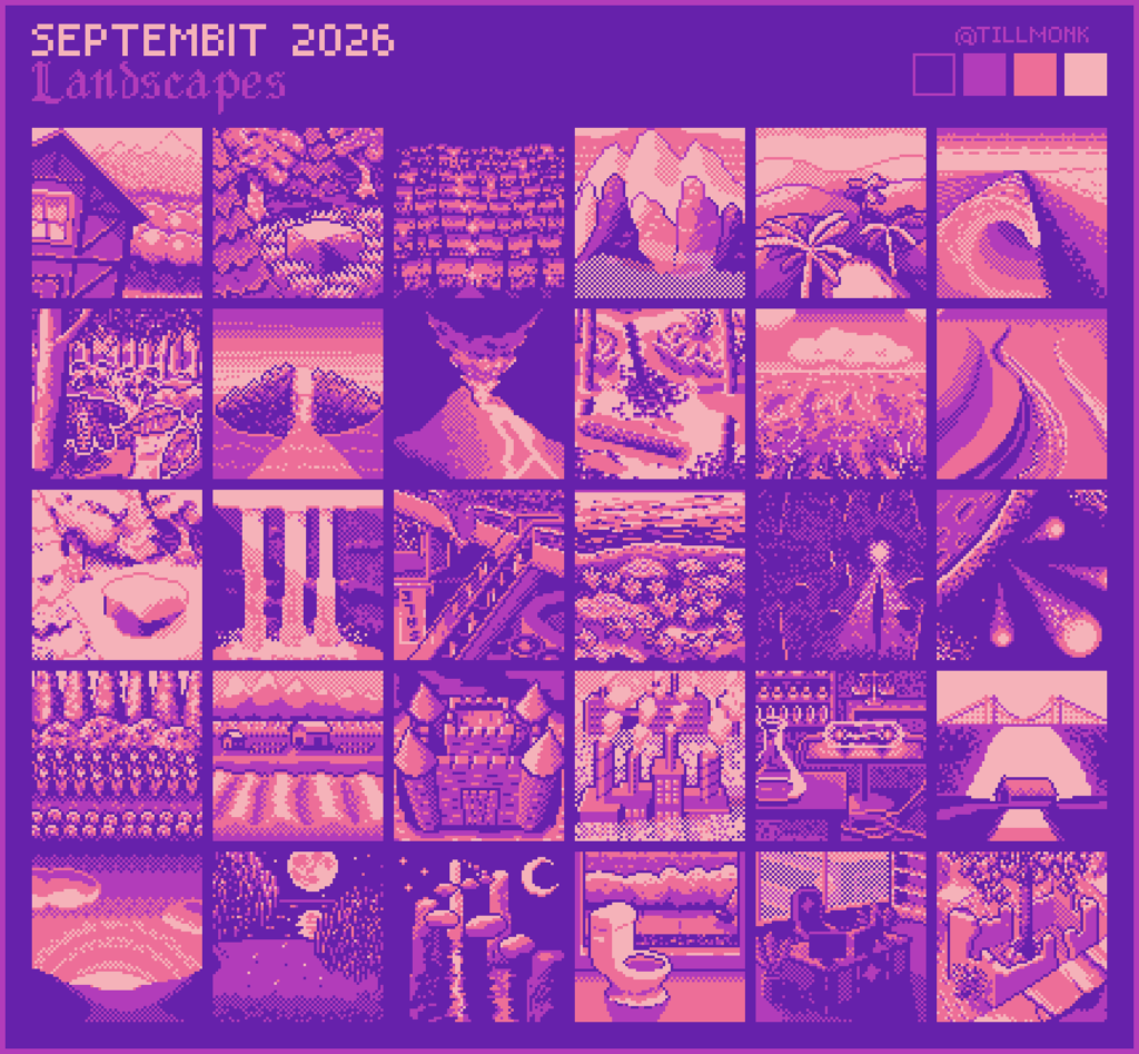
Row 1: Home, Forest, City, Mountain, Desert, Coast
Row 2: Jungle, Island, Volcano, Swamp, Ocean, Canyon
Row 3: Snowy, Waterfall, Abandoned, Underwater, Cave, Space
Row 4: Garden, Farm, Castle, Industrial, Laboratory, Bridges
Row 5: Sunset, Night, Magic, Dream, Evil, Future
Comments:
It was fun to pick the color palette myself this time. I tried to do proper “hue shifting” (where the lighter versions of a color get more yellow-tinged, as if illuminated by the sun, and where the darker versions of a color get more blue-tinged, as if in shadow [only illuminated by the blue sky]). But I also wanted the colors to be interesting.
I’m pretty happy with how most of these turned out. Less pleased with “Island,” I think “Desert” is a bit boring, and I wish I could have gotten the trees in “Night” to look more like weeping willows. But I love “Bridges” (the prompt was plural), and I love the way the water seems to glow in “Coast.” I think the lighting in “Volcano” is nice and “glow-y” too. I’m getting better at using shadows/shading to imply form/texture.
I wanted it to look like the house in “Home” was peeking its head into frame, and I think it worked. I wanted “Swamp” to look like you were looking at the reflections of trees in water whose edges were covered in the algae stuff you see in still ponds.
“Ocean” was tricky. I wanted it to look both like there were wave crests stretching off into the distance while also making the water seem transparent to the darker depths below. I don’t think I succeeded, but the result is still kind of interesting.
For “Snowy,” I reused the “Forest” picture, and then had some fun trying to figure out how to pile snow on things.
I’m really pleased with how the light and shadow turned out in “Waterfall,” and with how the “Abandoned” mall ended up.
In addition to trying to work with shadows (e.g., in “Cave”), I was also trying to practice perspective this time around. So, I ended up with slightly strange angles in “Abandoned” and “Castle,” as well as in the last three (“Dream,” “Evil,” and “Future”). I mean, not weird in the sense that no one has ever done them before — weird in the sense that I was trying to draw things from interesting angles, and I’m not as good at that as I would like to be.
For “Dream,” I decided to draw a nightmare, and for “Future,” I decided to draw something that gives me hope: plants always come back and overtake/break through all the stuff humans build to cover the soil.
I didn’t get all of these done in time. I didn’t finish the last one till October 3rd. But I think this may have ended up as my favorite set that I’ve done for Septembit.